\n
## Diagram: Predictive Posterior Inference Process
### Overview
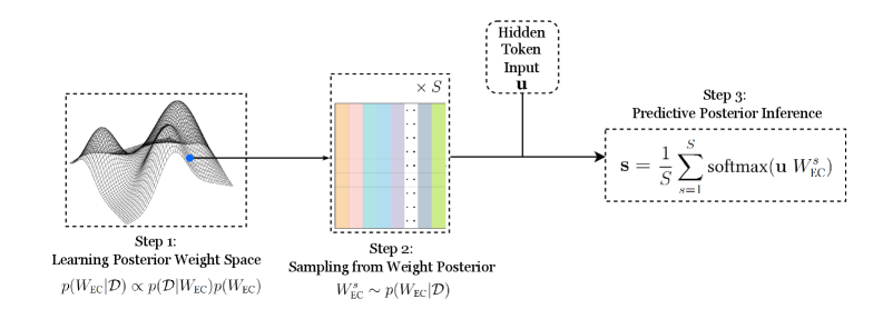
The image depicts a three-step process for predictive posterior inference. It illustrates a flow from learning a posterior weight space, sampling from that space, and finally performing predictive posterior inference. The diagram uses visual representations of mathematical concepts and equations to explain the process.
### Components/Axes
The diagram is divided into three main steps, labeled "Step 1", "Step 2", and "Step 3", arranged horizontally from left to right. Each step has a descriptive title and a corresponding visual representation.
* **Step 1: Learning Posterior Weight Space:** Visualized as a 3D surface plot with two blue dots on the surface. The equation below it is: `p(WEC|D) ∝ p(D|WEC)p(WEC)`
* **Step 2: Sampling from Weight Posterior:** Represented as a grid of colored rectangles (S x S). The equation below it is: `WEC ~ p(WEC|D)`
* **Step 3: Predictive Posterior Inference:** Shown as a box with an arrow pointing into it. The equation within the box is: `s = 1/S ∑ softmax(u WEC)` where the summation is from s=1 to S.
* **Hidden Token Input:** Labeled as "Hidden Token Input" and represented as a vertical arrow pointing towards Step 3. The variable is denoted as "u".
* **S:** Appears in the equations for Step 2 and Step 3, representing a dimension or size parameter.
### Detailed Analysis or Content Details
**Step 1:** The 3D surface plot represents a probability distribution over weights (WEC) given data (D). The two blue dots likely represent specific weight values sampled from this distribution. The equation indicates that the posterior probability of the weights given the data is proportional to the likelihood of the data given the weights multiplied by the prior probability of the weights.
**Step 2:** The grid of colored rectangles represents sampling from the posterior weight distribution. The dimensions of the grid are S x S. The equation indicates that a weight vector (WEC) is sampled from the posterior distribution p(WEC|D). The colors of the rectangles are varied, suggesting different sampled weight values.
**Step 3:** This step performs predictive inference using the sampled weights. The equation calculates a prediction 's' as the average of the softmax of the product of the hidden token input 'u' and each sampled weight vector WEC. The summation is performed over S samples.
### Key Observations
* The diagram illustrates a Bayesian approach to inference, where uncertainty is represented by a probability distribution over weights.
* The sampling step (Step 2) is crucial for approximating the posterior predictive distribution.
* The final prediction (Step 3) is a weighted average of the softmax outputs, where the weights are determined by the sampled weights.
* The variable 'S' appears to represent the number of samples used in the Monte Carlo approximation.
### Interpretation
The diagram describes a method for making predictions based on a Bayesian model. The process begins by learning a posterior distribution over the model's weights given the observed data. This posterior distribution represents our uncertainty about the true values of the weights. To make a prediction, we sample multiple weight vectors from this posterior distribution and average the predictions made by each weight vector. This averaging process effectively integrates over the uncertainty in the weights, resulting in a more robust and accurate prediction. The use of the softmax function suggests that the model is making predictions about a categorical variable. The "Hidden Token Input" (u) likely represents a feature vector or embedding of the input data. The diagram highlights the importance of representing uncertainty and using sampling techniques to approximate complex distributions. The diagram is a conceptual illustration of a Bayesian inference process, and does not contain specific numerical data.