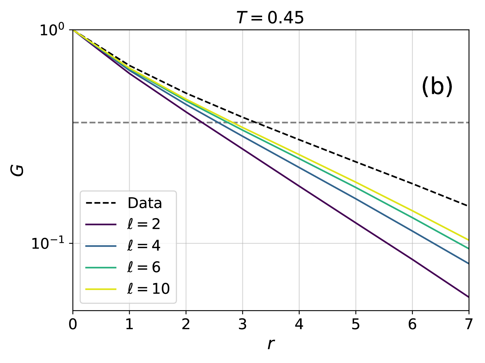
## Chart: G vs. r with varying l values
### Overview
The image presents a log-log plot showing the relationship between two variables, G and r, for different values of a parameter 'l'. A dashed black line represents experimental "Data", while solid colored lines represent theoretical curves for l = 2, 4, 6, and 10. The plot is labeled with T = 0.45 in the top-right corner and a label "(b)" in the top-right corner. The y-axis is logarithmic, ranging from 10⁰ to 10⁻¹. The x-axis, 'r', ranges from 0 to 7.
### Components/Axes
* **X-axis:** 'r' (ranging from 0 to 7, linear scale)
* **Y-axis:** 'G' (logarithmic scale, ranging from 10⁰ to 10⁻¹)
* **Title:** None explicitly present, but the chart depicts G vs. r.
* **Legend:** Located in the bottom-left corner.
* Data (dashed black line)
* l = 2 (purple line)
* l = 4 (blue line)
* l = 6 (green line)
* l = 10 (yellow line)
* **Parameter:** T = 0.45 (displayed at the top-center)
### Detailed Analysis
The chart displays five lines, each representing a different relationship between G and r.
* **Data (dashed black line):** This line slopes downward, approximately linearly on this log-log scale.
* At r = 0, G ≈ 1.0
* At r = 7, G ≈ 0.15
* **l = 2 (purple line):** This line starts at a higher G value than the 'Data' line and has a steeper negative slope.
* At r = 0, G ≈ 2.0
* At r = 7, G ≈ 0.05
* **l = 4 (blue line):** This line has a slope between the 'Data' line and the l=2 line.
* At r = 0, G ≈ 1.5
* At r = 7, G ≈ 0.1
* **l = 6 (green line):** This line has a slope less steep than the l=4 line, and is below the 'Data' line for r > ~2.
* At r = 0, G ≈ 1.2
* At r = 7, G ≈ 0.2
* **l = 10 (yellow line):** This line has the least steep slope and is below the 'Data' line for r > ~1.
* At r = 0, G ≈ 1.1
* At r = 7, G ≈ 0.3
All lines exhibit a decreasing trend as 'r' increases. The slopes of the lines vary depending on the value of 'l', with larger 'l' values resulting in shallower slopes.
### Key Observations
* The 'Data' line falls between the theoretical curves for l = 6 and l = 10.
* The theoretical curves converge as 'r' increases.
* The y-axis is logarithmic, indicating a power-law relationship between G and r.
* The parameter T = 0.45 is constant for all curves.
### Interpretation
The chart likely represents a comparison between experimental data and theoretical predictions for a physical system. The parameter 'l' likely represents a characteristic length or scale within the system, and 'r' represents a radial distance. The variable 'G' could represent a correlation function, a structure factor, or some other measure of spatial order.
The fact that the 'Data' line falls between the l = 6 and l = 10 curves suggests that the actual value of 'l' in the system is somewhere between these two values. The convergence of the theoretical curves as 'r' increases indicates that the system becomes more homogeneous at larger distances. The logarithmic scale suggests that the correlation between variables decays as a power law. The constant value of T = 0.45 may represent a temperature or other control parameter of the system.
The chart demonstrates how theoretical models can be used to interpret experimental data and gain insights into the underlying physics of a system. The discrepancies between the 'Data' line and the theoretical curves could indicate limitations of the model or the presence of additional factors not accounted for in the theory.