## Semi-Logarithmic Line Plot: Correlation Function G vs. Distance r
### Overview
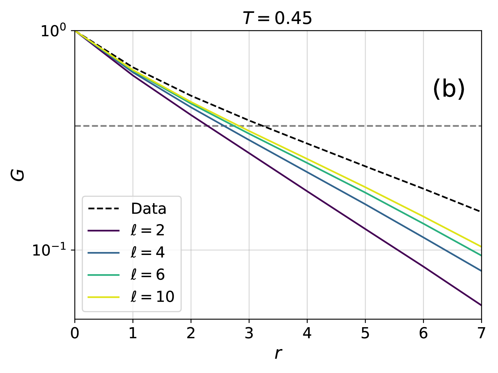
The image is a scientific line graph, specifically a semi-logarithmic plot (log scale on the y-axis, linear scale on the x-axis). It displays the decay of a quantity labeled "G" as a function of a variable "r" for a fixed parameter "T = 0.45". The plot compares a "Data" series against four theoretical or model curves parameterized by "ℓ". The label "(b)" in the top-right corner indicates this is panel (b) of a larger multi-panel figure.
### Components/Axes
* **Title:** `T = 0.45` (centered at the top).
* **Panel Label:** `(b)` (top-right corner).
* **Y-Axis:**
* **Label:** `G` (centered vertically on the left).
* **Scale:** Logarithmic (base 10).
* **Major Ticks/Labels:** `10^0` (top) and `10^-1` (bottom).
* **Grid:** Light gray vertical and horizontal grid lines are present.
* **X-Axis:**
* **Label:** `r` (centered horizontally at the bottom).
* **Scale:** Linear.
* **Major Ticks/Labels:** `0, 1, 2, 3, 4, 5, 6, 7`.
* **Legend:** Located in the bottom-left quadrant of the plot area. It contains five entries:
1. `--- Data` (black dashed line)
2. `— ℓ = 2` (purple solid line)
3. `— ℓ = 4` (blue solid line)
4. `— ℓ = 6` (green solid line)
5. `— ℓ = 10` (yellow solid line)
* **Reference Line:** A horizontal, gray, dashed line is present at an approximate value of `G ≈ 0.3` (or `3 x 10^-1`).
### Detailed Analysis
**Trend Verification:** All five data series exhibit a downward, approximately linear trend on this semi-log plot, indicating an exponential decay of `G` with increasing `r`. The lines are straight, confirming the functional form `G ∝ exp(-r/ξ)` for some decay length `ξ`.
**Data Series Analysis (from top to bottom at r=7):**
1. **Data (Black Dashed Line):** This series has the shallowest slope (slowest decay). It starts at `G(0) = 10^0 = 1`. At `r=7`, its value is approximately `G ≈ 0.15` (or `1.5 x 10^-1`).
2. **ℓ = 10 (Yellow Solid Line):** This is the next shallowest curve. It starts at `G(0)=1`. At `r=7`, its value is approximately `G ≈ 0.11`.
3. **ℓ = 6 (Green Solid Line):** This curve decays faster than the `ℓ=10` line. At `r=7`, its value is approximately `G ≈ 0.09`.
4. **ℓ = 4 (Blue Solid Line):** This curve decays faster than the `ℓ=6` line. At `r=7`, its value is approximately `G ≈ 0.07`.
5. **ℓ = 2 (Purple Solid Line):** This series has the steepest slope (fastest decay). It starts at `G(0)=1`. At `r=7`, its value is the lowest, approximately `G ≈ 0.04`.
**Key Relationship:** As the parameter `ℓ` increases (from 2 to 10), the slope of the `G(r)` curve becomes less steep, meaning the decay of `G` with distance `r` is slower. The "Data" series decays even more slowly than the model curve for the highest `ℓ` value shown (`ℓ=10`).
### Key Observations
* All curves originate from the same point `(r=0, G=1)`.
* The ordering of the curves by slope is consistent across the entire range of `r`: Data (shallowest) > ℓ=10 > ℓ=6 > ℓ=4 > ℓ=2 (steepest).
* The horizontal dashed reference line at `G ≈ 0.3` intersects the curves at different `r` values. For example, the `ℓ=2` curve crosses it near `r ≈ 2.5`, while the "Data" curve crosses it near `r ≈ 4.2`.
* The plot uses a clear color scheme (black, purple, blue, green, yellow) that is distinguishable and matches the legend precisely.
### Interpretation
This plot demonstrates the spatial decay of a correlation function `G(r)` at a fixed temperature `T=0.45`. The "Data" line likely represents empirical results (e.g., from simulation or experiment). The solid lines for different `ℓ` values represent predictions from a theoretical model where `ℓ` is a key parameter.
The central finding is that the model's predicted decay rate is strongly dependent on `ℓ`: larger `ℓ` values produce slower decay, better matching the shallow slope of the empirical "Data". However, even the model with the largest `ℓ` shown (`ℓ=10`) still predicts a faster decay than the actual data. This suggests that the model, with the tested parameters, underestimates the correlation length (the distance over which `G` remains significant) of the system being studied. The horizontal dashed line at `G ≈ 0.3` may represent a threshold for "significant" correlation, highlighting how much farther correlations persist in the data compared to the models. The parameter `T=0.45` is held constant, so this plot specifically isolates the effect of `ℓ` on the spatial correlations at that temperature.