TECHNICAL ASSET FINGERPRINT
faa922537381bb2c1021c1d0
Click to view fullscreen
Press ESC or click to close
FOUND IN PAPERS
EXPERT: gemini-2.5-flash-free VERSION 1
RUNTIME: google-free/gemini-2.5-flash
INTEL_VERIFIED
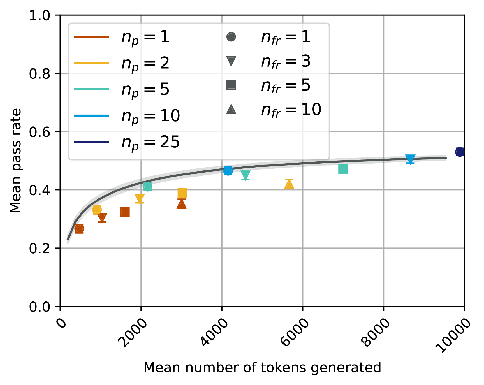
## Chart Type: Scatter Plot with Fitted Curve
### Overview
This image displays a scatter plot illustrating the relationship between "Mean number of tokens generated" and "Mean pass rate". The data points are categorized by two parameters, `n_p` (represented by color) and `n_fr` (represented by marker shape), and a fitted curve with a confidence interval is overlaid to show the general trend.
### Components/Axes
**X-axis:**
* **Title:** "Mean number of tokens generated"
* **Range:** Approximately 0 to 10000
* **Major Tick Marks:** 0, 2000, 4000, 6000, 8000, 10000. The labels are rotated counter-clockwise by approximately 45 degrees.
* **Minor Grid Lines:** Present at intervals of approximately 1000.
**Y-axis:**
* **Title:** "Mean pass rate"
* **Range:** Approximately 0.0 to 1.0
* **Major Tick Marks:** 0.0, 0.2, 0.4, 0.6, 0.8, 1.0
* **Minor Grid Lines:** Present at intervals of approximately 0.1.
**Legend (Top-Center, within the plot area):**
The legend is divided into two columns, indicating two independent variables: `n_p` (number of passes) and `n_fr` (number of failures/retries, inferred from context).
* **Left Column (Line colors for `n_p`):**
* Brown line: `n_p = 1`
* Goldenrod/Yellow line: `n_p = 2`
* Teal/Light Blue line: `n_p = 5`
* Blue line: `n_p = 10`
* Dark Blue/Navy line: `n_p = 25`
* **Right Column (Marker shapes for `n_fr`):**
* Dark Grey circle: `n_fr = 1`
* Dark Grey inverted triangle: `n_fr = 3`
* Dark Grey square: `n_fr = 5`
* Dark Grey triangle: `n_fr = 10`
**Fitted Curve:**
A solid dark grey line represents the overall trend, starting low and increasing, then flattening out. It is accompanied by a lighter grey shaded area, which likely indicates a confidence interval or standard error around the fitted curve.
### Detailed Analysis
**Overall Trend of Fitted Curve:**
The dark grey fitted curve shows a clear positive, non-linear relationship. It starts at a "Mean pass rate" of approximately 0.2 at low "Mean number of tokens generated" (around 0-200), rises steeply, and then gradually flattens out, approaching a "Mean pass rate" of about 0.5 to 0.53 as the "Mean number of tokens generated" increases towards 10000. The light grey shaded area around the curve suggests a relatively narrow confidence interval, indicating good fit or low uncertainty for the trend.
**Data Points (Scatter Plot):**
Each data point is represented by a specific color (for `n_p`) and marker shape (for `n_fr`). All scatter points include small vertical error bars, indicating variability in the "Mean pass rate".
1. **`n_p = 1` (Brown points):**
* `n_fr = 1` (Circle): X ~ 500, Y ~ 0.26
* `n_fr = 3` (Inverted Triangle): X ~ 1200, Y ~ 0.31
* `n_fr = 5` (Square): X ~ 1800, Y ~ 0.33
* `n_fr = 10` (Triangle): X ~ 3000, Y ~ 0.35
2. **`n_p = 2` (Goldenrod/Yellow points):**
* `n_fr = 1` (Circle): X ~ 800, Y ~ 0.32
* `n_fr = 3` (Inverted Triangle): X ~ 1500, Y ~ 0.36
* `n_fr = 5` (Square): X ~ 2500, Y ~ 0.38
* `n_fr = 10` (Triangle): X ~ 5500, Y ~ 0.42
3. **`n_p = 5` (Teal/Light Blue points):**
* `n_fr = 1` (Circle): X ~ 2000, Y ~ 0.41
* `n_fr = 3` (Inverted Triangle): X ~ 3200, Y ~ 0.43
* `n_fr = 5` (Square): X ~ 4500, Y ~ 0.48
* `n_fr = 10` (Triangle): X ~ 7000, Y ~ 0.49
4. **`n_p = 10` (Blue points):**
* `n_fr = 1` (Circle): X ~ 4200, Y ~ 0.47
* `n_fr = 3` (Inverted Triangle): X ~ 4800, Y ~ 0.45
* `n_fr = 5` (Square): X ~ 8500, Y ~ 0.51
5. **`n_p = 25` (Dark Blue/Navy point):**
* `n_fr = 1` (Circle): X ~ 9800, Y ~ 0.53
### Key Observations
* **General Increase:** All data series generally show an increase in "Mean pass rate" as "Mean number of tokens generated" increases, consistent with the fitted curve.
* **Impact of `n_p`:** For a given `n_fr` (same marker shape), higher `n_p` values (represented by colors from brown to dark blue) tend to correspond to higher "Mean pass rates" and often higher "Mean number of tokens generated". For example, comparing `n_fr=1` (circles):
* `n_p=1` (brown circle) is at (500, 0.26)
* `n_p=2` (goldenrod circle) is at (800, 0.32)
* `n_p=5` (teal circle) is at (2000, 0.41)
* `n_p=10` (blue circle) is at (4200, 0.47)
* `n_p=25` (dark blue circle) is at (9800, 0.53)
This indicates a strong positive correlation between `n_p` and both "Mean number of tokens generated" and "Mean pass rate".
* **Impact of `n_fr`:** For a given `n_p` (same color), increasing `n_fr` (from circle to triangle) generally leads to an increase in "Mean number of tokens generated" and a slight, but less consistent, increase or plateau in "Mean pass rate". For example, for `n_p=1` (brown points), as `n_fr` increases from 1 to 10, "Mean number of tokens generated" increases from ~500 to ~3000, and "Mean pass rate" increases from ~0.26 to ~0.35.
* **Saturation:** The "Mean pass rate" appears to saturate around 0.5 to 0.53, even with very high "Mean number of tokens generated" (e.g., 8000-10000) and high `n_p` values.
* **Data Distribution:** The data points are not uniformly distributed; there are more points at lower "Mean number of tokens generated" values, and fewer points as "Mean number of tokens generated" approaches 10000. The highest `n_p` value (`n_p=25`) only has one data point shown.
### Interpretation
The chart suggests that both `n_p` and `n_fr` parameters influence the "Mean number of tokens generated" and, consequently, the "Mean pass rate".
1. **`n_p` as a primary driver:** Higher values of `n_p` (number of passes) are strongly associated with both a greater "Mean number of tokens generated" and a higher "Mean pass rate". This implies that increasing the number of passes in a process (perhaps an iterative generation or refinement process) leads to more extensive output (more tokens) and better performance (higher pass rate). The progression of colors from brown to dark blue clearly illustrates this, with `n_p=25` achieving the highest pass rate and token count among the observed points.
2. **`n_fr` as a secondary driver/modifier:** The `n_fr` parameter (number of failures/retries) also contributes to the "Mean number of tokens generated". For a fixed `n_p`, increasing `n_fr` generally pushes the data points further to the right on the X-axis, meaning more tokens are generated. However, its impact on the "Mean pass rate" is less pronounced and more variable compared to `n_p`. This could suggest that while allowing more retries or failures might lead to more attempts and thus more generated tokens, it doesn't necessarily translate to a proportionally higher pass rate, especially as the pass rate approaches its saturation point.
3. **Performance Ceiling:** The fitted curve and the clustering of higher `n_p` points indicate a diminishing return on increasing "Mean number of tokens generated" beyond a certain point (e.g., ~6000-7000 tokens). The "Mean pass rate" seems to plateau around 0.5 to 0.53. This suggests that there might be an inherent limit to the "pass rate" achievable with the current system or methodology, regardless of how many tokens are generated or how many passes/retries are allowed. Further increases in `n_p` or `n_fr` beyond certain thresholds might only lead to more tokens generated without significant improvements in the pass rate.
In essence, to maximize the "Mean pass rate", one should aim for higher `n_p` values, which will naturally lead to more tokens generated. While `n_fr` also increases token generation, its direct impact on the pass rate is less clear, especially at higher token counts where the system appears to hit a performance ceiling.
DECODING INTELLIGENCE...