\n
## Chart: Token Frequency Distribution - Question vs. Answer
### Overview
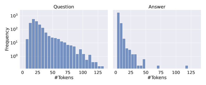
The image presents two histograms displayed side-by-side. The left histogram represents the frequency distribution of the number of tokens in "Question" data, while the right histogram represents the frequency distribution of the number of tokens in "Answer" data. Both histograms use a logarithmic scale on the y-axis (Frequency).
### Components/Axes
* **X-axis (both charts):** "#Tokens" - representing the number of tokens. The scale ranges from 0 to 125, with markings at 0, 25, 50, 75, 100, and 125.
* **Y-axis (both charts):** "Frequency" - representing the number of occurrences. The scale is logarithmic, ranging from 10⁰ (1) to 10³ (1000).
* **Title (left chart):** "Question"
* **Title (right chart):** "Answer"
* **Bar Color (both charts):** Blue.
### Detailed Analysis
**Left Chart (Question):**
The histogram shows a decreasing frequency as the number of tokens increases. The highest frequency occurs between 0 and 25 tokens. The distribution appears to be right-skewed.
* Approximately 800-900 occurrences between 0-25 tokens.
* Approximately 200-300 occurrences between 25-50 tokens.
* Approximately 80-120 occurrences between 50-75 tokens.
* Approximately 30-50 occurrences between 75-100 tokens.
* Approximately 10-20 occurrences between 100-125 tokens.
**Right Chart (Answer):**
The histogram also shows a decreasing frequency as the number of tokens increases, but the decrease is much more rapid than in the "Question" chart. The highest frequency occurs between 0 and 25 tokens. The distribution is strongly right-skewed.
* Approximately 1000-1200 occurrences between 0-25 tokens.
* Approximately 50-80 occurrences between 25-50 tokens.
* Approximately 5-10 occurrences between 50-75 tokens.
* Approximately 1-2 occurrences between 75-100 tokens.
* Approximately less than 1 occurrence between 100-125 tokens.
### Key Observations
* The "Answer" data has a much higher concentration of short token sequences (0-25 tokens) compared to the "Question" data.
* The "Question" data has a longer tail, indicating a greater number of questions with a higher number of tokens.
* Both distributions are right-skewed, meaning that most questions and answers are relatively short, but there are some longer ones.
* The y-axis is logarithmic, which emphasizes the differences in frequency for lower token counts.
### Interpretation
The data suggests that answers tend to be significantly shorter than questions. This is a common characteristic of question-answering systems, where questions often require more context and detail than the corresponding answers. The logarithmic scale highlights the dramatic difference in frequency between the most common token counts and the less common ones. The right skewness in both distributions indicates that while most questions and answers are concise, there's a non-negligible portion that are more elaborate. This could be due to complex questions requiring detailed answers, or questions that are themselves lengthy and require extensive context. The difference in the distributions between questions and answers suggests a compression of information during the answering process.