## Bar Chart: CoC (try Python except LM state)
### Overview
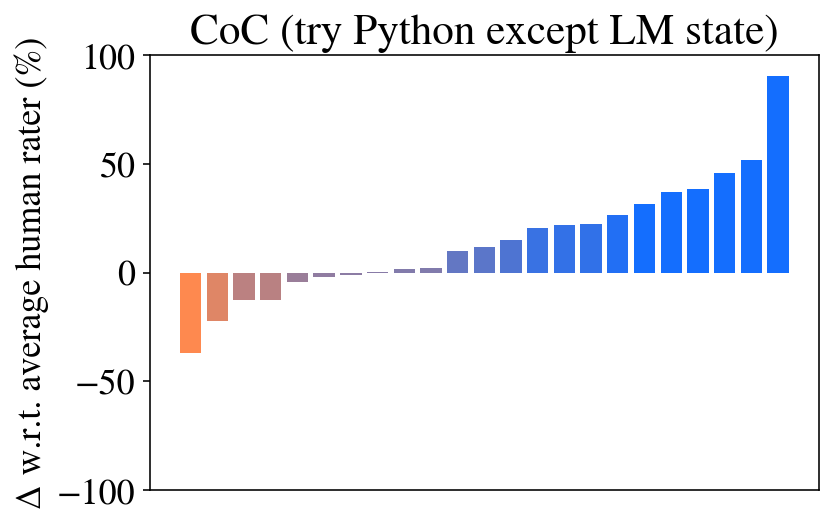
The image is a vertical bar chart titled "CoC (try Python except LM state)". It displays the percentage change (Δ) in performance relative to an average human rater for a series of unnamed items or conditions. The chart shows a clear progression from negative to positive values, with the final bar showing a substantial positive change.
### Components/Axes
* **Title:** "CoC (try Python except LM state)" - Located at the top center of the chart.
* **Y-Axis:**
* **Label:** "Δ w.r.t. average human rater (%)". This indicates the metric is the percentage change compared to a baseline of an average human rater.
* **Scale:** Linear scale ranging from -100 to 100.
* **Major Tick Marks:** Located at -100, -50, 0, 50, and 100.
* **X-Axis:** No explicit label or category names are provided. It contains a sequence of 20 bars.
* **Data Series:** A single series of 20 vertical bars, colored in a gradient from orange/brown on the left to blue on the right. There is no explicit legend provided within the image frame.
### Detailed Analysis
The chart consists of 20 bars arranged from left to right. Their approximate values, based on visual alignment with the y-axis, are as follows:
1. **Bar 1 (Leftmost, Orange):** Approximately -40%.
2. **Bar 2 (Orange-Brown):** Approximately -25%.
3. **Bar 3 (Brown):** Approximately -15%.
4. **Bar 4 (Brown-Purple):** Approximately -12%.
5. **Bar 5 (Purple):** Approximately -5%.
6. **Bar 6 (Purple):** Approximately -2%.
7. **Bar 7 (Purple):** Approximately -1%.
8. **Bar 8 (Purple):** Approximately 0% (appears as a very thin line at the baseline).
9. **Bar 9 (Purple-Blue):** Approximately +1%.
10. **Bar 10 (Blue-Purple):** Approximately +8%.
11. **Bar 11 (Blue):** Approximately +12%.
12. **Bar 12 (Blue):** Approximately +18%.
13. **Bar 13 (Blue):** Approximately +22%.
14. **Bar 14 (Blue):** Approximately +23%.
15. **Bar 15 (Blue):** Approximately +28%.
16. **Bar 16 (Blue):** Approximately +32%.
17. **Bar 17 (Blue):** Approximately +38%.
18. **Bar 18 (Blue):** Approximately +40%.
19. **Bar 19 (Blue):** Approximately +48%.
20. **Bar 20 (Rightmost, Blue):** Approximately +52%.
21. **Bar 21 (Final, Bright Blue):** Approximately +90%. (Note: There appear to be 21 distinct bars upon closer inspection, with the final one being significantly taller).
**Trend:** The data series exhibits a strong, consistent upward trend from left to right. It begins with negative values (underperformance relative to the human baseline), crosses the zero point around the 8th/9th bar, and then shows increasingly positive values (outperformance), culminating in a final bar that is a clear outlier in magnitude.
### Key Observations
1. **Clear Progression:** There is a monotonic increase in the Δ value across the sequence of bars.
2. **Performance Crossover:** The transition from negative to positive Δ occurs near the center of the chart, indicating a shift from underperforming to outperforming the human rater baseline.
3. **Significant Outlier:** The final bar on the far right shows a Δ of approximately +90%, which is nearly double the value of the second-highest bar (~+52%). This represents a dramatic performance leap.
4. **Color Gradient:** The bar colors transition smoothly from warm tones (orange/brown) for negative values to cool tones (blue) for positive values, visually reinforcing the performance shift.
### Interpretation
This chart likely visualizes the results of an experiment or benchmark comparing different versions, configurations, or methods of an AI system (possibly related to "CoC" - Chain of Code - and Python exception handling) against a human performance baseline.
* **What the data suggests:** The sequence of bars probably represents an ordered list of models, prompts, or techniques. The leftmost items perform worse than the average human rater, while the rightmost items significantly surpass it. The dramatic spike at the end suggests a particular method or model variant that is exceptionally effective for the task measured.
* **How elements relate:** The x-axis order is critical, as it shows a deliberate ranking or progression. The color gradient is not merely aesthetic but encodes the performance direction (negative=warm, positive=cool). The title implies the task involves a programming concept ("try...except" in Python) within a "CoC" framework, and the metric evaluates how well the system's output aligns with or exceeds human judgment.
* **Notable anomalies:** The final bar's height is the most notable anomaly, suggesting a breakthrough or a different class of solution compared to the incremental improvements seen in the preceding bars. The lack of x-axis labels is a significant limitation, preventing identification of which specific methods correspond to which performance level.