\n
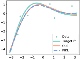
## Chart: Function Approximation Comparison
### Overview
The image presents a chart comparing the performance of different function approximation methods: Data, Target function (f*), Ordinary Least Squares (OLS), and Path-Integrated Kernel Learning (PIKL). The chart displays these methods as curves plotted against an x-axis ranging from approximately -3 to 3. The y-axis represents the function values, ranging from approximately -4 to 1.
### Components/Axes
* **X-axis:** Labeled with numerical values ranging from -3 to 3, with tick marks at integer values.
* **Y-axis:** Labeled with numerical values ranging from -4 to 1, with tick marks at integer values.
* **Legend:** Located in the top-right corner of the chart. It identifies the following data series:
* "Data" (represented by light green circles)
* "Target f*" (represented by a light teal solid line)
* "OLS" (represented by a light orange solid line)
* "PIKL" (represented by a dashed blue line)
### Detailed Analysis
* **Data:** The "Data" series consists of approximately 10 scattered light green circles. The points are distributed across the x-axis, with a concentration around x = -2, x = 0, and x = 2. The y-values for these points are approximately: (-3, -2.5), (-2, -1.8), (-1, 0.8), (0, 0.9), (1, -0.5), (2, 0.1), (3, 0.6).
* **Target f*:** The "Target f*" series is a smooth, light teal curve that resembles a parabola opening downwards. It reaches a maximum value of approximately 1 at x = 0. The curve is symmetrical around the y-axis.
* **OLS:** The "OLS" series is a light orange solid line that closely follows the "Target f*" curve. It also resembles a parabola, with a maximum value of approximately 1 at x = 0. There is a slight deviation from the "Target f*" curve around x = 1 and x = -1.
* **PIKL:** The "PIKL" series is a dashed blue line that also closely follows the "Target f*" curve. It is very similar to the "OLS" curve, with a maximum value of approximately 1 at x = 0. There is a slight deviation from the "Target f*" curve around x = -3 and x = 3.
**Trend Verification:**
* The "Target f*" line exhibits a parabolic shape, peaking at x=0.
* The "OLS" line generally follows the "Target f*" line, showing an upward trend until x=0 and then a downward trend.
* The "PIKL" line mirrors the "OLS" line's trend, closely approximating the "Target f*" curve.
* The "Data" points are scattered, but generally align with the overall parabolic shape.
### Key Observations
* Both "OLS" and "PIKL" methods provide very good approximations of the "Target f*" function.
* The "OLS" and "PIKL" curves are almost indistinguishable from each other visually.
* The "Data" points are somewhat noisy, but they generally support the shape of the "Target f*" function.
* There is a slight divergence between the "OLS" and "PIKL" curves and the "Target f*" curve at the extreme ends of the x-axis (around x = -3 and x = 3).
### Interpretation
The chart demonstrates the effectiveness of both OLS and PIKL methods in approximating an unknown target function (f*) based on a set of noisy data points. The close alignment of the OLS and PIKL curves with the Target f* suggests that both methods are capable of capturing the underlying functional relationship. The slight deviations at the edges of the x-axis might indicate limitations in the methods' ability to extrapolate beyond the range of the observed data. The data points themselves provide the basis for the approximation, and their distribution influences the accuracy of the resulting curves. The chart suggests that, in this particular case, PIKL and OLS perform similarly well in function approximation.