## Diagram: Grid with Highlighted Region
### Overview
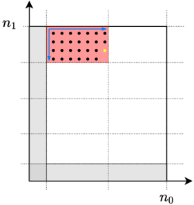
The image is a diagram of a grid, with a specific rectangular region highlighted in red. Black dots are distributed within this red region, and a single yellow dot is also present. Blue arrows indicate a path along the perimeter of the red region. The axes are labeled n0 and n1.
### Components/Axes
* **X-axis:** Labeled "n0" at the bottom-right corner.
* **Y-axis:** Labeled "n1" at the top-left corner.
* **Grid:** The grid consists of dashed lines, dividing the space into equal squares.
* **Highlighted Region:** A rectangular region in the top-left quadrant is highlighted in red.
* **Dots:** Multiple black dots are distributed within the red region. A single yellow dot is also present within the red region.
* **Arrows:** Blue arrows trace a path along the top and left edges of the red region.
* **Grey Shading:** The bottom-right corner and the bottom-left corner are shaded in grey.
### Detailed Analysis
* The red highlighted region spans approximately 2 grid units along the n0 axis and 2 grid units along the n1 axis.
* The black dots are arranged in a grid-like pattern within the red region. There are approximately 6 rows and 5 columns of black dots.
* The yellow dot is located near the bottom-right corner of the red region.
* The blue arrows indicate a path starting from the bottom-left corner of the red region, moving right along the top edge, and then down along the left edge.
### Key Observations
* The diagram emphasizes a specific rectangular region within a larger grid.
* The distribution of black dots within the red region suggests a structured arrangement.
* The yellow dot may represent a specific point of interest within the highlighted region.
* The blue arrows indicate a specific traversal path along the perimeter of the highlighted region.
### Interpretation
The diagram likely represents a concept related to grid-based data or algorithms. The highlighted region could represent a subset of data being processed, and the dots could represent individual data points. The yellow dot might represent a specific data point being analyzed or a target location. The blue arrows could represent the steps of an algorithm operating on the data within the highlighted region. The grey shading in the corners might represent areas outside the scope of the current operation. The diagram could be used to illustrate concepts in image processing, data analysis, or algorithm design.