## Line Chart: Information Gain vs. R² Value During Training
### Overview
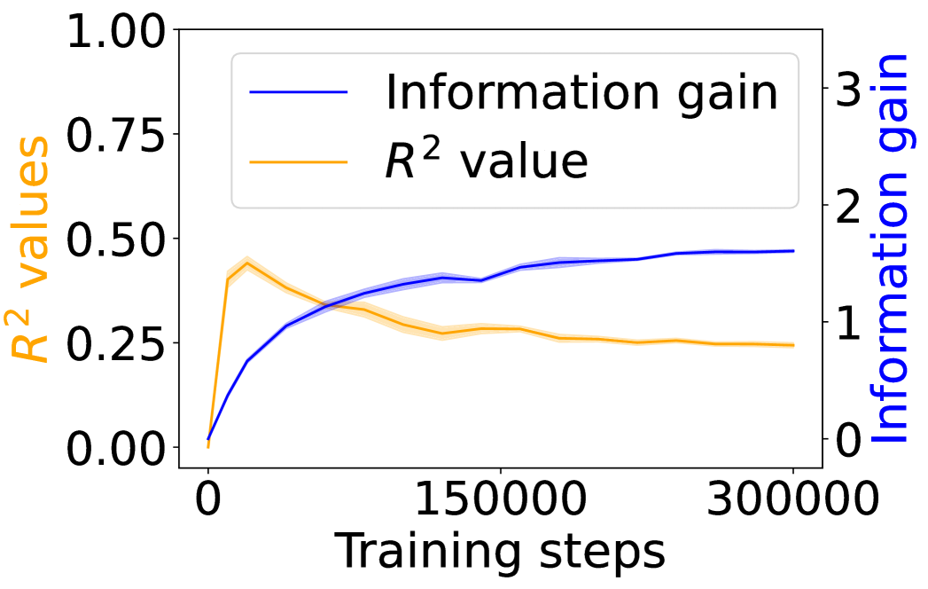
The image is a line chart comparing the "Information gain" and "R² value" over a number of "Training steps". The x-axis represents the number of training steps, ranging from 0 to 300,000. The left y-axis represents the R² values, ranging from 0.00 to 1.00. The right y-axis represents the Information gain, ranging from 0 to 3. The chart displays two lines: a blue line representing the Information gain and an orange line representing the R² value. Both lines have shaded regions around them, indicating uncertainty or variance.
### Components/Axes
* **X-axis:** "Training steps", ranging from 0 to 300000, with a marker at 150000.
* **Left Y-axis:** "R² values", ranging from 0.00 to 1.00, with markers at 0.00, 0.25, 0.50, 0.75, and 1.00.
* **Right Y-axis:** "Information gain", ranging from 0 to 3, with markers at 0, 1, 2, and 3.
* **Legend (top-center):**
* Blue line: "Information gain"
* Orange line: "R² value"
### Detailed Analysis
* **Information gain (Blue line):** The information gain starts at approximately 0 at 0 training steps. It increases rapidly initially, then the rate of increase slows down, and it plateaus around 1.5 after approximately 150,000 training steps. The final value at 300,000 training steps is approximately 1.6.
* (0, ~0)
* (150000, ~1.5)
* (300000, ~1.6)
* **R² value (Orange line):** The R² value starts at approximately 0 at 0 training steps. It increases rapidly initially, reaching a peak around 0.45 at approximately 25,000 training steps. After that, it decreases gradually and plateaus around 0.25 after approximately 150,000 training steps. The final value at 300,000 training steps is approximately 0.25.
* (0, ~0)
* (25000, ~0.45)
* (150000, ~0.25)
* (300000, ~0.25)
### Key Observations
* The Information gain and R² value both start at 0.
* The Information gain increases and plateaus, while the R² value increases, then decreases and plateaus.
* The Information gain has a higher final value than the R² value.
* Both lines have shaded regions, indicating uncertainty or variance in the data.
### Interpretation
The chart illustrates the relationship between Information gain and R² value as a model is trained over a number of steps. The Information gain increases as the model learns, eventually plateauing, suggesting that the model is extracting most of the available information from the data. The R² value, which represents the proportion of variance explained by the model, initially increases but then decreases, suggesting that the model may be overfitting to the training data after a certain number of steps. The plateauing of both metrics suggests that further training may not significantly improve the model's performance. The shaded regions indicate the variability in the results, possibly due to different training runs or variations in the data.