## Dual-Axis Line Chart: Model Training Metrics (R² Value vs. Information Gain)
### Overview
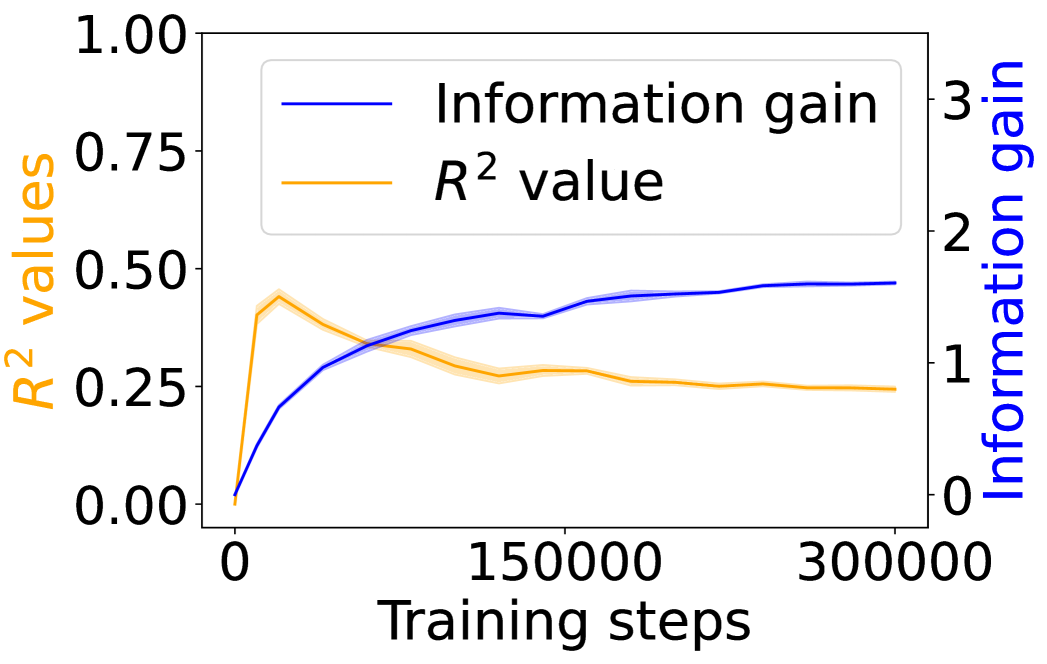
The image displays a dual-axis line chart plotting two different metrics against the number of training steps for a machine learning model. The chart compares the progression of the model's explanatory power (R² value) and its information gain over the course of training.
### Components/Axes
* **Chart Type:** Dual-axis line chart.
* **X-Axis (Bottom):**
* **Label:** "Training steps"
* **Scale:** Linear scale from 0 to 300,000.
* **Major Ticks:** 0, 150000, 300000.
* **Primary Y-Axis (Left):**
* **Label:** "R² values" (text is orange, matching its data series).
* **Scale:** Linear scale from 0.00 to 1.00.
* **Major Ticks:** 0.00, 0.25, 0.50, 0.75, 1.00.
* **Secondary Y-Axis (Right):**
* **Label:** "Information gain" (text is blue, matching its data series).
* **Scale:** Linear scale from 0 to 3.
* **Major Ticks:** 0, 1, 2, 3.
* **Legend (Top-Left Corner):**
* A blue line segment labeled "Information gain".
* An orange line segment labeled "R² value".
* **Data Series:**
1. **Information Gain (Blue Line):** A solid blue line with a light blue shaded area around it, likely representing a confidence interval or standard deviation.
2. **R² Value (Orange Line):** A solid orange line with a light orange shaded area around it.
### Detailed Analysis
**Trend Verification & Data Points:**
1. **Information Gain (Blue Line - Right Axis):**
* **Trend:** The line shows a steep, concave-down increase from the start, followed by a gradual plateau. It slopes upward sharply initially, then the rate of increase slows significantly after approximately 100,000 steps.
* **Approximate Data Points:**
* At 0 steps: ~0.0
* At ~25,000 steps: ~0.7
* At ~50,000 steps: ~1.0
* At ~100,000 steps: ~1.3
* At 150,000 steps: ~1.4
* At 300,000 steps: ~1.5 (appears to plateau near this value).
2. **R² Value (Orange Line - Left Axis):**
* **Trend:** The line exhibits a sharp initial peak followed by a gradual decline and stabilization. It slopes upward very steeply to a peak, then slopes downward at a decreasing rate, eventually flattening out.
* **Approximate Data Points:**
* At 0 steps: 0.00
* At ~10,000 steps (Peak): ~0.45
* At ~50,000 steps: ~0.35
* At 150,000 steps: ~0.27
* At 300,000 steps: ~0.25 (appears to stabilize near this value).
**Spatial Grounding:** The legend is positioned in the top-left quadrant of the plot area. The blue "Information gain" line is consistently plotted against the right-hand y-axis, and the orange "R² value" line is consistently plotted against the left-hand y-axis. The shaded bands around each line are narrow, suggesting relatively low variance in the measurements.
### Key Observations
1. **Inverse Relationship Post-Peak:** After the initial training phase (first ~20,000 steps), the two metrics move in opposite directions. As information gain continues to increase, the R² value decreases from its peak.
2. **Divergent Plateaus:** The information gain metric appears to reach a plateau at a higher relative value on its scale (~1.5 out of 3) compared to the R² value's plateau (~0.25 out of 1.0).
3. **Early Peak in R²:** The R² value achieves its maximum very early in the training process, suggesting the model's ability to explain variance in the training data was highest at that point.
4. **Convergence of Trends:** Both lines show a significant reduction in their rate of change after approximately 150,000 training steps, indicating the model's training dynamics have largely stabilized.
### Interpretation
This chart illustrates a potential trade-off or decoupling between two model performance indicators during extended training.
* **What the data suggests:** The continuous rise in "Information gain" indicates the model is consistently learning and extracting more information from the data as training progresses. However, the decline and stabilization of the "R² value" after an early peak suggests that while the model is learning, its ability to fit the specific training data (as measured by R²) diminishes and then holds steady. This could be a sign of the model moving from memorizing/simplistic fitting towards learning more generalizable features, or it could indicate a form of overfitting where increased complexity (information gain) does not translate to better explanatory power on the same data.
* **Relationship between elements:** The dual-axis format is crucial here, as it allows the comparison of two metrics with different scales. The inverse trend after the initial phase is the most salient feature, highlighting that more training steps (and higher information gain) do not monotonically improve all performance metrics.
* **Notable Anomalies:** The sharp, early peak in R² is the most notable anomaly. It implies an optimal point for that specific metric was reached very early, and subsequent training, while increasing information gain, did not recover that level of fit. The stabilization of both metrics after ~150,000 steps suggests diminishing returns for further training beyond this point for these particular measures.