\n
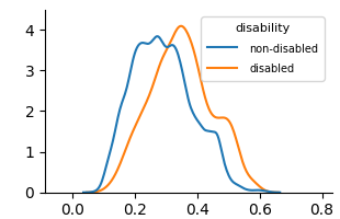
## Density Plot: Disability Status
### Overview
The image presents a density plot comparing the distribution of a variable (likely a score or index) for individuals with and without disabilities. The plot visualizes the probability density of the variable for each group.
### Components/Axes
* **X-axis:** Ranges from approximately 0.0 to 0.8, with tick marks at 0.0, 0.2, 0.4, 0.6, and 0.8. The axis is not explicitly labeled, but represents the value of the variable being measured.
* **Y-axis:** Ranges from approximately 0.0 to 4.0, with tick marks at 0.0, 1.0, 2.0, 3.0, and 4.0. This represents the probability density.
* **Legend:** Located in the top-right corner, labeled "disability". It contains two entries:
* "non-disabled" – represented by a blue line.
* "disabled" – represented by an orange line.
### Detailed Analysis
* **Non-disabled (Blue Line):** The density curve for non-disabled individuals rises from approximately 0.0 at x=0.0, reaches a peak density of approximately 3.8 at x=0.22, and then gradually declines, reaching approximately 0.0 at x=0.65.
* **Disabled (Orange Line):** The density curve for disabled individuals rises from approximately 0.0 at x=0.0, reaches a peak density of approximately 4.0 at x=0.35, and then declines more rapidly than the non-disabled curve, reaching approximately 0.0 at x=0.55.
### Key Observations
* The distribution for disabled individuals is more concentrated around lower values of the variable compared to non-disabled individuals.
* The peak density for disabled individuals is slightly higher than that for non-disabled individuals.
* The non-disabled group has a longer tail extending towards higher values of the variable.
### Interpretation
The data suggests that the variable being measured tends to have lower values for individuals with disabilities compared to those without disabilities. The higher peak density for the disabled group indicates a greater concentration of individuals around that lower value. The difference in distributions could indicate a systematic difference in the characteristic being measured between the two groups. It is important to note that this is a density plot, and does not provide information about the absolute number of individuals in each group. The variable could represent a score on a test, a measure of performance, or any other quantitative characteristic. Without knowing what the variable represents, it is difficult to draw definitive conclusions. However, the plot clearly demonstrates a difference in the distribution of the variable between individuals with and without disabilities.