\n
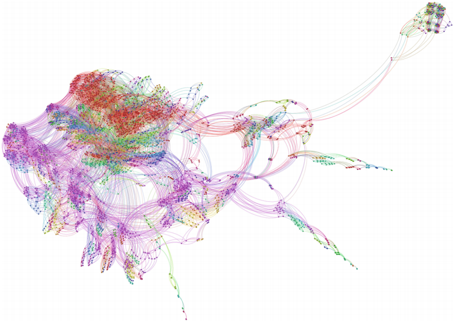
## Network Graph: Complex Interconnection Visualization
### Overview
The image presents a complex network graph, visually representing interconnected nodes with varying degrees of connection. The graph is densely populated, particularly in the left and center regions, with connections represented by curved lines of varying colors. There are no explicit axes, labels, or legends present within the image itself. The visualization appears to be a force-directed graph, where nodes repel each other and connections act as springs, resulting in a layout that attempts to minimize edge crossings and maximize clarity.
### Components/Axes
There are no explicit axes or labels. The components are:
* **Nodes:** Represented by small colored circles.
* **Edges:** Represented by curved lines connecting the nodes. The edges vary in color.
* **Color Coding:** The nodes and edges are color-coded, but the meaning of the colors is not provided.
### Detailed Analysis or Content Details
Due to the lack of labels and a legend, precise data extraction is impossible. However, we can describe the visual characteristics:
* **Node Density:** The left side of the image exhibits the highest node density, forming a large, somewhat amorphous cluster. There is a smaller, more defined cluster in the upper-right corner.
* **Edge Density:** The central region has a very high edge density, with numerous lines crisscrossing. The edges become sparser towards the periphery.
* **Color Distribution:**
* **Purple/Violet:** Dominates the left cluster. Approximately 40% of the nodes are shades of purple.
* **Red/Orange:** Concentrated in the upper-center region. Roughly 20% of the nodes are red or orange.
* **Green/Teal:** Predominantly found in the lower-right tail of the graph. About 15% of the nodes are green or teal.
* **Blue:** Scattered throughout, but more prevalent in the upper-right cluster. Approximately 10% of the nodes are blue.
* **Yellow/Brown:** Less frequent, appearing as isolated nodes or within the denser clusters. About 15% of the nodes are yellow or brown.
* **Edge Colors:** The edges exhibit a similar color distribution to the nodes, suggesting a possible correlation between node color and the color of its connections. However, there are many edges connecting nodes of different colors.
* **Connection Patterns:** Many nodes have multiple connections, indicating a high degree of interconnectedness. Some nodes appear to be "hubs" with a significantly larger number of connections than others.
### Key Observations
* **Clustering:** The graph clearly exhibits clustering, with distinct groups of nodes forming identifiable regions.
* **Hubs:** The presence of hub nodes suggests that certain entities within the network have a disproportionate influence or play a central role in information flow.
* **Color Correlation:** While not definitive, there appears to be a tendency for nodes of similar colors to connect with each other.
* **Asymmetry:** The graph is not symmetrical. The left side is much denser and more complex than the right side.
### Interpretation
This visualization likely represents a complex system of relationships, such as a social network, a biological network (e.g., protein interactions), or a communication network. The lack of labels makes it difficult to determine the specific entities represented by the nodes and the nature of the connections.
The clustering suggests that the system is organized into distinct communities or groups. The hub nodes likely represent key individuals or entities that bridge these communities. The color coding could represent different categories or attributes of the nodes, but without a legend, this is speculative.
The asymmetry of the graph suggests that the system is not uniformly connected. The denser left side may represent a more established or influential part of the network, while the sparser right side may represent a newer or less developed area.
Without further information, it is impossible to draw definitive conclusions about the meaning of this graph. However, the visualization provides a valuable overview of the network's structure and highlights key patterns and relationships. The image is a visual representation of data, but does not provide the underlying data itself. It is a descriptive visualization, not a quantitative one.