## Line Charts: Contrast vs. Frequency
### Overview
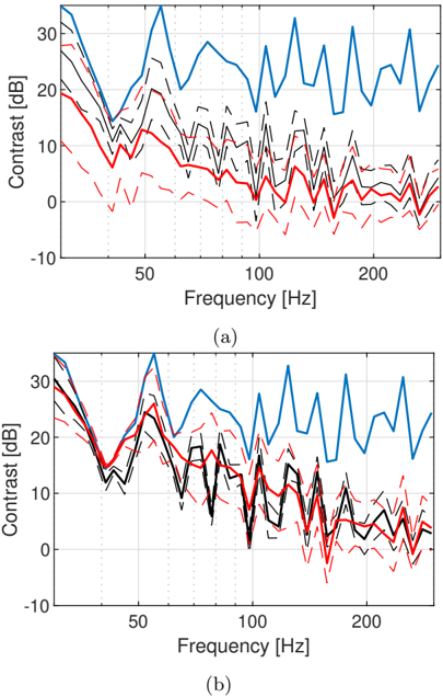
The image contains two line charts, (a) and (b), each displaying the relationship between "Contrast [dB]" on the y-axis and "Frequency [Hz]" on the x-axis. Each chart contains multiple data series represented by lines of different colors and styles (solid, dashed). The charts appear to compare different conditions or measurements, with the blue line consistently showing the highest contrast across the frequency range.
### Components/Axes
* **Y-axis (Contrast):** Labeled "Contrast [dB]". The scale ranges from -10 to 30 dB, with tick marks at -10, 0, 10, 20, and 30 dB.
* **X-axis (Frequency):** Labeled "Frequency [Hz]". The scale ranges from approximately 20 to 240 Hz, with tick marks at 50, 100, and 200 Hz.
* **Data Series:** Each chart contains a blue solid line, a red solid line, and several black dashed lines and a red dashed line. The exact meaning of each line is not specified in the image, but they likely represent different experimental conditions or statistical variations.
* **Chart Labels:** The charts are labeled (a) and (b) below the x-axis.
### Detailed Analysis
**Chart (a):**
* **Blue Solid Line:** This line represents the highest contrast values. It starts at approximately 20 dB at 20 Hz, increases to approximately 35 dB around 60 Hz, and then fluctuates between 15 dB and 35 dB for the rest of the frequency range.
* **Red Solid Line:** This line represents a lower contrast value. It starts at approximately 18 dB at 20 Hz, decreases to approximately 5 dB around 100 Hz, and then remains relatively stable between 0 dB and 5 dB for the rest of the frequency range.
* **Black Dashed Lines:** These lines show a range of contrast values between the blue and red solid lines. They generally start around 20 dB at 20 Hz, decrease to between 0 dB and 10 dB around 100 Hz, and then fluctuate between 0 dB and 15 dB for the rest of the frequency range.
* **Red Dashed Line:** This line represents the lowest contrast values. It starts at approximately 10 dB at 20 Hz, decreases to approximately -5 dB around 70 Hz, and then fluctuates between -5 dB and 5 dB for the rest of the frequency range.
**Chart (b):**
* **Blue Solid Line:** Similar to chart (a), this line represents the highest contrast values. It starts at approximately 20 dB at 20 Hz, increases to approximately 35 dB around 60 Hz, and then fluctuates between 15 dB and 35 dB for the rest of the frequency range.
* **Red Solid Line:** This line represents a lower contrast value. It starts at approximately 25 dB at 20 Hz, decreases to approximately 10 dB around 100 Hz, and then remains relatively stable between 5 dB and 15 dB for the rest of the frequency range.
* **Black Dashed Lines:** These lines show a range of contrast values between the blue and red solid lines. They generally start around 25 dB at 20 Hz, decrease to between 5 dB and 15 dB around 100 Hz, and then fluctuate between 0 dB and 15 dB for the rest of the frequency range.
* **Red Dashed Line:** This line represents the lowest contrast values. It starts at approximately 15 dB at 20 Hz, decreases to approximately 0 dB around 70 Hz, and then fluctuates between -5 dB and 10 dB for the rest of the frequency range.
### Key Observations
* In both charts, the blue line consistently exhibits the highest contrast across the frequency spectrum.
* The red solid line and black dashed lines show a general decreasing trend in contrast as frequency increases, especially up to 100 Hz.
* The red dashed line consistently shows the lowest contrast values in both charts.
* The contrast values tend to fluctuate more at higher frequencies (above 100 Hz) compared to lower frequencies.
* Chart (b) shows a slightly higher contrast for the red solid line and black dashed lines at lower frequencies compared to chart (a).
### Interpretation
The charts likely represent the contrast performance of a system or device across different frequencies under different conditions. The blue line could represent an ideal or maximum performance scenario, while the red solid line and black dashed lines represent more typical or varied performance levels. The red dashed line might represent a worst-case scenario or a specific degraded condition.
The data suggests that the system's contrast performance is generally better at lower frequencies, with a noticeable drop-off as frequency increases, especially up to 100 Hz. The fluctuations at higher frequencies could indicate increased noise or instability in the system's response.
The difference between charts (a) and (b) suggests that there is a slight variation in the system's performance under different conditions, with chart (b) showing a slightly better contrast at lower frequencies for the red solid line and black dashed lines. This could be due to variations in experimental setup, environmental factors, or system parameters.