\n
## Chart: Contrast vs. Frequency
### Overview
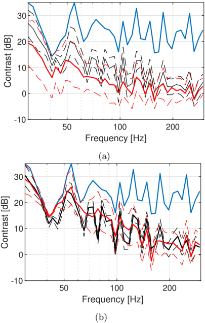
The image presents two line charts, labeled (a) and (b), displaying contrast in decibels (dB) as a function of frequency in Hertz (Hz). Each chart features multiple lines representing different data series. The charts appear to compare contrast levels across a range of frequencies.
### Components/Axes
* **X-axis:** Frequency [Hz], ranging from approximately 0 to 250 Hz. The scale is linear.
* **Y-axis:** Contrast [dB], ranging from approximately -10 dB to 30 dB. The scale is linear.
* **Data Series:** Each chart contains three distinct line series, visually differentiated by color and line style.
* Blue Line: Solid line, representing the highest contrast values.
* Red Line: Dashed line, representing lower contrast values.
* Black Lines: Multiple solid lines, representing intermediate contrast values.
* **Labels:**
* Chart (a) is labeled "(a)" in the bottom-left corner.
* Chart (b) is labeled "(b)" in the bottom-left corner.
### Detailed Analysis or Content Details
**Chart (a):**
* **Blue Line:** The blue line starts at approximately 28 dB at 0 Hz, decreases to around 15 dB at 20 Hz, then fluctuates between approximately 15 dB and 30 dB for the remainder of the frequency range, exhibiting a generally oscillating pattern with high frequency variations.
* **Red Line:** The red line begins at approximately 5 dB at 0 Hz, decreases to around -5 dB at 20 Hz, and then fluctuates between approximately -5 dB and 10 dB for the rest of the frequency range, showing a similar oscillating pattern but with lower overall contrast.
* **Black Lines:** There are multiple black lines. They generally fall between the blue and red lines in terms of contrast. They start around 10-20 dB at 0 Hz, decrease to around 0-5 dB at 20 Hz, and then fluctuate between approximately 0 dB and 15 dB.
**Chart (b):**
* **Blue Line:** The blue line starts at approximately 30 dB at 0 Hz, decreases to around 18 dB at 20 Hz, and then fluctuates between approximately 18 dB and 32 dB for the remainder of the frequency range, exhibiting a generally oscillating pattern with high frequency variations.
* **Red Line:** The red line begins at approximately 18 dB at 0 Hz, decreases to around 8 dB at 20 Hz, and then fluctuates between approximately 8 dB and 20 dB for the rest of the frequency range, showing a similar oscillating pattern but with lower overall contrast.
* **Black Lines:** There are multiple black lines. They generally fall between the blue and red lines in terms of contrast. They start around 15-25 dB at 0 Hz, decrease to around 5-10 dB at 20 Hz, and then fluctuate between approximately 5 dB and 18 dB.
### Key Observations
* Both charts exhibit similar trends, with all lines showing a decrease in contrast at lower frequencies (up to approximately 20 Hz) followed by fluctuations at higher frequencies.
* The blue line consistently represents the highest contrast levels in both charts.
* The red line consistently represents the lowest contrast levels in both charts.
* Chart (b) generally shows higher contrast values across all frequencies compared to chart (a).
* The black lines show a range of contrast values, suggesting variability within the data.
### Interpretation
The charts likely represent the frequency response of a system or process related to contrast perception or measurement. The differences between charts (a) and (b) could indicate variations in experimental conditions, system parameters, or data processing methods. The decrease in contrast at lower frequencies might be due to limitations in the system's ability to resolve or detect contrast at those frequencies. The fluctuating contrast at higher frequencies suggests a more complex relationship between frequency and contrast, potentially involving interference or resonance effects. The multiple black lines indicate that there is a distribution of contrast values at each frequency, suggesting that the system's response is not uniform. The data suggests that the system performs better at higher frequencies, as indicated by the higher contrast values observed in that range. The consistent pattern across both charts suggests a robust underlying relationship between frequency and contrast.