## Line Charts: Misleading Hints vs. Performance Metrics
### Overview
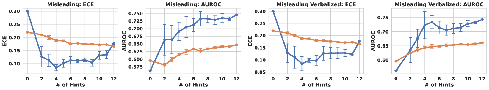
The image contains four line charts, arranged in a 2x2 grid. Each chart plots the relationship between the number of misleading hints (x-axis) and either Expected Calibration Error (ECE) or Area Under the Receiver Operating Characteristic Curve (AUROC) (y-axis). The charts are titled "Misleading: ECE", "Misleading: AUROC", "Misleading Verbalized: ECE", and "Misleading Verbalized: AUROC". Each chart contains two data series, represented by a blue line and an orange line. Error bars are present on the blue lines.
### Components/Axes
* **X-axis (all charts):** "# of Hints". Scale ranges from 0 to 12 in increments of 2.
* **Y-axis (Misleading: ECE and Misleading Verbalized: ECE):** "ECE". Scale ranges from 0.05 to 0.30 in increments of 0.05.
* **Y-axis (Misleading: AUROC and Misleading Verbalized: AUROC):** "AUROC". Scale ranges from 0.575 to 0.750 in increments of 0.025.
* **Data Series:**
* Blue line: The specific meaning of this line is not explicitly stated in the image.
* Orange line: The specific meaning of this line is not explicitly stated in the image.
### Detailed Analysis
**1. Misleading: ECE**
* **Blue Line Trend:** The blue line starts at approximately 0.30 and decreases sharply until x=4, reaching a value of approximately 0.08. It then increases slightly to approximately 0.12 at x=6, remains relatively flat until x=10, and then increases again to approximately 0.14 at x=12.
* Data Points: (0, 0.30), (2, 0.15), (4, 0.08), (6, 0.12), (8, 0.10), (10, 0.11), (12, 0.14)
* **Orange Line Trend:** The orange line starts at approximately 0.22 and gradually decreases to approximately 0.17 at x=12.
* Data Points: (0, 0.22), (2, 0.21), (4, 0.19), (6, 0.18), (8, 0.18), (10, 0.175), (12, 0.17)
**2. Misleading: AUROC**
* **Blue Line Trend:** The blue line starts at approximately 0.57 and increases steadily until x=12, reaching a value of approximately 0.75. The rate of increase slows down after x=8.
* Data Points: (0, 0.57), (2, 0.66), (4, 0.68), (6, 0.72), (8, 0.73), (10, 0.72), (12, 0.75)
* **Orange Line Trend:** The orange line starts at approximately 0.59 and increases gradually to approximately 0.67 at x=12.
* Data Points: (0, 0.59), (2, 0.61), (4, 0.63), (6, 0.64), (8, 0.65), (10, 0.66), (12, 0.67)
**3. Misleading Verbalized: ECE**
* **Blue Line Trend:** The blue line starts at approximately 0.30 and decreases sharply until x=4, reaching a value of approximately 0.08. It then increases slightly to approximately 0.10 at x=6, remains relatively flat until x=10, and then increases again to approximately 0.12 at x=12.
* Data Points: (0, 0.30), (2, 0.13), (4, 0.08), (6, 0.10), (8, 0.095), (10, 0.11), (12, 0.12)
* **Orange Line Trend:** The orange line starts at approximately 0.22 and gradually decreases to approximately 0.17 at x=12.
* Data Points: (0, 0.22), (2, 0.21), (4, 0.19), (6, 0.18), (8, 0.18), (10, 0.17), (12, 0.17)
**4. Misleading Verbalized: AUROC**
* **Blue Line Trend:** The blue line starts at approximately 0.53 and increases steadily until x=12, reaching a value of approximately 0.76. The rate of increase slows down after x=8.
* Data Points: (0, 0.53), (2, 0.64), (4, 0.70), (6, 0.72), (8, 0.71), (10, 0.72), (12, 0.76)
* **Orange Line Trend:** The orange line starts at approximately 0.59 and increases gradually to approximately 0.67 at x=12.
* Data Points: (0, 0.59), (2, 0.61), (4, 0.63), (6, 0.64), (8, 0.65), (10, 0.66), (12, 0.67)
### Key Observations
* For both "Misleading" and "Misleading Verbalized" conditions, the ECE (blue line) initially decreases sharply with the number of hints, then plateaus and slightly increases. The orange line decreases gradually.
* For both "Misleading" and "Misleading Verbalized" conditions, the AUROC (blue line) increases steadily with the number of hints. The orange line increases gradually.
* The error bars on the blue lines indicate the variability in the data.
### Interpretation
The charts suggest that providing misleading hints initially improves the calibration (decreases ECE) and increases the discriminative power (increases AUROC) of a model (blue line). However, after a certain number of hints, the ECE starts to increase again, indicating that too many misleading hints can negatively impact calibration. The AUROC continues to increase, but at a slower rate. The orange line represents a different condition or model, and its performance is less affected by the number of misleading hints. The "Verbalized" condition seems to have a similar effect as the "Misleading" condition, but the initial impact on AUROC is more pronounced. Without knowing what the blue and orange lines represent, it is difficult to draw more specific conclusions.