\n
## Line Charts: WRITE pulses vs. Epoch for Neural Network Layers
### Overview
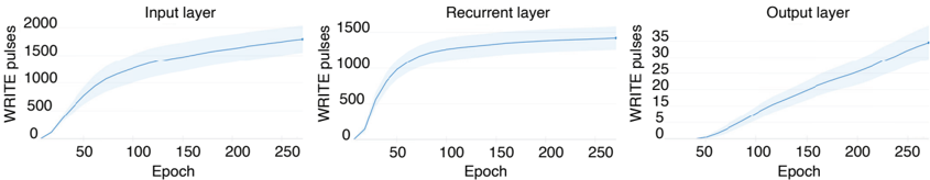
The image presents three line charts, arranged horizontally. Each chart depicts the relationship between "WRITE pulses" (y-axis) and "Epoch" (x-axis) for a different layer of a neural network: Input layer, Recurrent layer, and Output layer. Each line chart also includes a shaded region around the line, likely representing a standard deviation or confidence interval.
### Components/Axes
* **X-axis (all charts):** "Epoch", ranging from approximately 0 to 250. The axis is labeled with numerical markers at intervals of 50.
* **Y-axis (Input & Recurrent layers):** "WRITE pulses", ranging from 0 to 2000 (Input) and 0 to 1500 (Recurrent). The axis is labeled with numerical markers at intervals of 500.
* **Y-axis (Output layer):** "WRITE pulses", ranging from 0 to 35. The axis is labeled with numerical markers at intervals of 5.
* **Chart Titles:** "Input layer", "Recurrent layer", "Output layer" positioned above each respective chart.
* **Data Series:** Each chart contains a single blue line representing the average "WRITE pulses" over epochs, with a light blue shaded area indicating the variance.
### Detailed Analysis or Content Details
**Input Layer:**
* The line slopes upward, indicating an increase in WRITE pulses with increasing epochs.
* At Epoch 50, WRITE pulses are approximately 100.
* At Epoch 100, WRITE pulses are approximately 500.
* At Epoch 150, WRITE pulses are approximately 1000.
* At Epoch 200, WRITE pulses are approximately 1500.
* At Epoch 250, WRITE pulses are approximately 1900.
* The shaded region is wider at higher epochs, suggesting greater variance in WRITE pulses.
**Recurrent Layer:**
* The line also slopes upward, but the initial increase is more rapid than in the Input layer.
* At Epoch 50, WRITE pulses are approximately 200.
* At Epoch 100, WRITE pulses are approximately 700.
* At Epoch 150, WRITE pulses are approximately 1200.
* At Epoch 200, WRITE pulses are approximately 1400.
* At Epoch 250, WRITE pulses are approximately 1500.
* The shaded region is relatively consistent across epochs.
**Output Layer:**
* The line slopes upward, but the increase is slower and the absolute values are much lower than the other two layers.
* At Epoch 50, WRITE pulses are approximately 2.
* At Epoch 100, WRITE pulses are approximately 8.
* At Epoch 150, WRITE pulses are approximately 15.
* At Epoch 200, WRITE pulses are approximately 25.
* At Epoch 250, WRITE pulses are approximately 32.
* The shaded region is wider at higher epochs, similar to the Input layer.
### Key Observations
* All three layers exhibit a positive correlation between Epoch and WRITE pulses.
* The Recurrent layer shows the most rapid initial increase in WRITE pulses.
* The Output layer has significantly lower WRITE pulse values compared to the Input and Recurrent layers.
* The variance in WRITE pulses appears to increase with the number of epochs for the Input and Output layers.
### Interpretation
The charts demonstrate how the number of WRITE pulses changes over the training process (epochs) for different layers of a neural network. WRITE pulses likely represent a measure of activity or updates within each layer. The differing rates of increase and absolute values suggest that each layer learns and processes information at a different pace and scale. The increasing variance at higher epochs for the Input and Output layers could indicate that the learning process becomes more unstable or less predictable as training progresses. The lower WRITE pulse values in the Output layer might suggest that this layer requires less frequent updates or has a different role in the network's overall function. The data suggests that the network is learning, as evidenced by the increasing WRITE pulses in all layers, but the learning dynamics differ significantly between layers.