## Histogram: Distribution of Thinking Tokens
### Overview
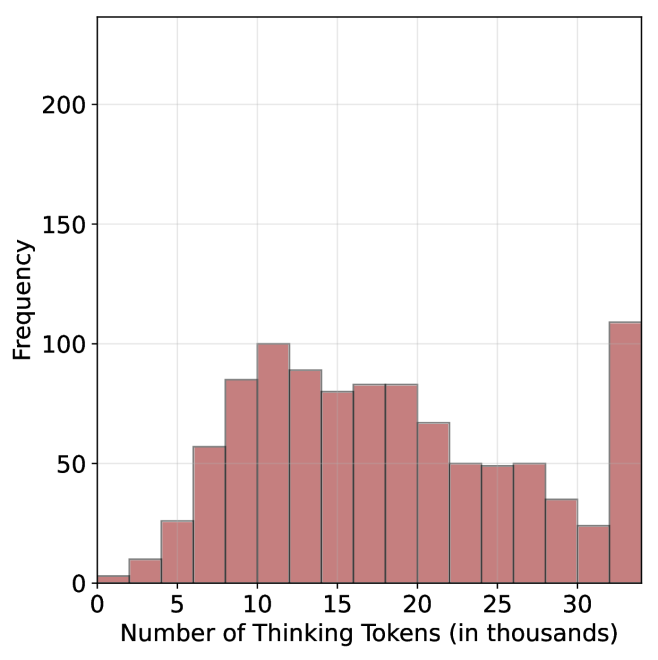
The image is a histogram showing the distribution of "Thinking Tokens" in thousands. The x-axis represents the number of thinking tokens, and the y-axis represents the frequency of occurrence. The histogram bars are a reddish-brown color.
### Components/Axes
* **X-axis:** "Number of Thinking Tokens (in thousands)". The axis ranges from approximately 0 to 35, with tick marks at intervals of 5 (5, 10, 15, 20, 25, 30).
* **Y-axis:** "Frequency". The axis ranges from 0 to 200, with tick marks at intervals of 50 (50, 100, 150, 200).
* **Bars:** The histogram consists of reddish-brown bars representing the frequency of each range of thinking tokens.
### Detailed Analysis
Here's a breakdown of the approximate frequency for each range of thinking tokens:
* **0-5:** Frequency is approximately 10.
* **5-7.5:** Frequency is approximately 60.
* **7.5-10:** Frequency is approximately 85.
* **10-12.5:** Frequency is approximately 100.
* **12.5-15:** Frequency is approximately 90.
* **15-17.5:** Frequency is approximately 80.
* **17.5-20:** Frequency is approximately 80.
* **20-22.5:** Frequency is approximately 70.
* **22.5-25:** Frequency is approximately 50.
* **25-27.5:** Frequency is approximately 50.
* **27.5-30:** Frequency is approximately 35.
* **30-32.5:** Frequency is approximately 25.
* **32.5-35:** Frequency is approximately 110.
### Key Observations
* The distribution is somewhat skewed to the right, with a peak around 10-12.5 thousand thinking tokens.
* There is a significant increase in frequency at the highest range (32.5-35 thousand tokens).
### Interpretation
The histogram suggests that the most common number of "Thinking Tokens" falls between 10,000 and 12,500. The spike at the end (32.5-35 thousand) indicates a secondary, significant group with a much higher number of tokens. This could represent an outlier group or a different category within the data. The overall distribution shows a moderate level of variability in the number of thinking tokens.