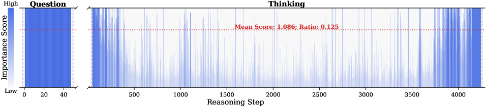
## Chart: Question Importance Score vs. Reasoning Step
### Overview
The image presents two charts side-by-side. The left chart, labeled "Question," displays a dense vertical distribution of blue lines, representing the importance score. The right chart, labeled "Thinking," shows the importance score fluctuating across reasoning steps. A red dotted line indicates the mean score and ratio in the "Thinking" chart.
### Components/Axes
* **Left Chart (Question):**
* **Title:** Question
* **Y-axis:** Importance Score, ranging from "Low" at the bottom to "High" at the top.
* **X-axis:** No explicit label, but the scale ranges from 0 to 40.
* **Right Chart (Thinking):**
* **Title:** Thinking
* **Y-axis:** Implicitly Importance Score, similar to the left chart.
* **X-axis:** Reasoning Step, ranging from 0 to 4000.
* **Red Dotted Line:** Represents "Mean Score: 1.086; Ratio: 0.125".
### Detailed Analysis
* **Left Chart (Question):**
* The blue lines are densely packed, indicating a high concentration of importance scores across the range.
* The distribution appears relatively uniform, with no clear peaks or valleys.
* The importance score ranges from approximately 0 to the maximum value.
* **Right Chart (Thinking):**
* The blue lines fluctuate significantly across the reasoning steps, indicating varying importance scores.
* The density of the lines appears higher at the beginning and end of the reasoning steps, suggesting higher importance scores in those regions.
* The red dotted line representing the mean score is positioned at approximately 1.086 on the implicit y-axis.
* The importance score ranges from approximately 0 to the maximum value.
### Key Observations
* The "Question" chart shows a general distribution of importance scores, while the "Thinking" chart shows how the importance score changes during the reasoning process.
* The mean score in the "Thinking" chart is relatively low compared to the potential range of the importance score.
* The "Thinking" chart exhibits more variability than the "Question" chart.
### Interpretation
The data suggests that the importance score of the question varies significantly during the reasoning process. The higher density of lines at the beginning and end of the "Thinking" chart might indicate that the question is initially and finally considered more important than during the intermediate reasoning steps. The relatively low mean score suggests that, on average, the question's importance is not consistently high throughout the reasoning process. The "Question" chart provides a baseline distribution of importance scores, while the "Thinking" chart shows the dynamic changes in importance during reasoning. The ratio of 0.125 is not clearly defined in the context of the image, but it likely relates to the distribution or characteristics of the importance scores.