## Scatter Plot: Accuracy vs. EOdd
### Overview
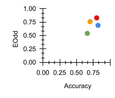
The image is a scatter plot displaying the relationship between "Accuracy" on the x-axis and "EOdd" on the y-axis. Four data points are plotted, each represented by a different color: red, orange, blue, and green. The plot appears to show the performance of different models or algorithms, with each point indicating a specific accuracy and EOdd value.
### Components/Axes
* **X-axis:** "Accuracy", ranging from 0.00 to approximately 1.00, with tick marks at intervals of 0.25.
* **Y-axis:** "EOdd", ranging from 0.00 to approximately 1.00, with tick marks at intervals of 0.25.
* **Data Points:** Four colored data points: red, orange, blue, and green. There is no legend.
### Detailed Analysis
* **Red Data Point:** Located at approximately Accuracy = 0.75, EOdd = 0.82.
* **Orange Data Point:** Located at approximately Accuracy = 0.70, EOdd = 0.75.
* **Blue Data Point:** Located at approximately Accuracy = 0.75, EOdd = 0.70.
* **Green Data Point:** Located at approximately Accuracy = 0.65, EOdd = 0.52.
### Key Observations
* All data points are clustered in the upper-right quadrant of the plot, indicating relatively high accuracy and EOdd values.
* The red data point has the highest EOdd value, while the green data point has the lowest.
* The green data point has the lowest accuracy value.
### Interpretation
The scatter plot visualizes the trade-off between accuracy and EOdd (Equality of Odds). Each colored point likely represents a different model or configuration. The clustering of points suggests that achieving both high accuracy and high EOdd simultaneously might be challenging. The red point represents a model with the highest EOdd but not necessarily the highest accuracy, while the green point represents a model with lower accuracy and EOdd. The choice of which model to use would depend on the specific application and the relative importance of accuracy versus fairness (as EOdd is a fairness metric).